i've put these little blank card packs together for your designing pleasure! there are so many fun ways to make business cards for small businesses, hobbyists and everyday creators. it occurred to me while working at the papery that not everyone has a trimming board (or endless hours + a ruler) so these little cards are the perfect starting point. here is some inspiration for you:

30.5.13


art | rie kono
to me, the paintings of Rie Kono are celebratory, optimistic and whimsical. the scenes draw you in with their joy and force you to stick around and examine all the details. Oh to live in such a world!


28.5.13
musings | branding & cohesiveness
lately i've been thinking a lot about how i can create things that are new and different while still maintaining a cohesive style or "brand." i think it's important that when people see creative work, they can associate it with a particular person. even when it comes to artists, i prefer that they have a unique signature to their work. of course it's appropriate for creators to grow and develop their products, but i still think that there should be something signifying and recognizable.

but what do you do when you want to try something different? i'm not saying i'm going to start selling tea cozies or fimo beads...i still want to stay in the realm of stationery. but i'm pondering how i can try new styles and techniques but still have people see my stationery and think "oh gosh that looks like isavirtue!" (no one ever has or likely ever will say that but a gal can dream :)

i think i've found some direction on this topic however. while reading a frankie article about australian book cover illustrator allison colpoys, the topic of cohesiveness came up. she was developing a new look for a collection of childhood classics. allison described how, before she began, she had to develop a set of "rules." i understood these rules to mean defining features that would tie normally disparate books together. The books were of different story lines, characters and by varying authors but the design elements, the illustrative style and the positioning and fonts held them together.

which means i need some rules. a list of key factors to refer back to when i feel that i'm getting off track, or want to try something new. i'm going to list some ideas/"rules" here, but i would also love to hear your opinion as sometimes you're too close to something to really see it properly!
craftsmanship:
1/ stationery is carefully crafted by hand and all products are templated, cut and folded.
2/ each piece maintains an attention to detail and are imbued with pride.
style:
3/ clean lines, simplicity and obvious statements.
4/ cohesive palette, rounded corners, embossed inks, thick cardstock
character:
5/ products and brand provide a sense of nostalgia for a lost art
6/ encourages letter writing, personal heartfelt sentiments and thoughtful gift giving.
but what do you do when you want to try something different? i'm not saying i'm going to start selling tea cozies or fimo beads...i still want to stay in the realm of stationery. but i'm pondering how i can try new styles and techniques but still have people see my stationery and think "oh gosh that looks like isavirtue!" (no one ever has or likely ever will say that but a gal can dream :)
i think i've found some direction on this topic however. while reading a frankie article about australian book cover illustrator allison colpoys, the topic of cohesiveness came up. she was developing a new look for a collection of childhood classics. allison described how, before she began, she had to develop a set of "rules." i understood these rules to mean defining features that would tie normally disparate books together. The books were of different story lines, characters and by varying authors but the design elements, the illustrative style and the positioning and fonts held them together.
craftsmanship:
1/ stationery is carefully crafted by hand and all products are templated, cut and folded.
2/ each piece maintains an attention to detail and are imbued with pride.
style:
3/ clean lines, simplicity and obvious statements.
4/ cohesive palette, rounded corners, embossed inks, thick cardstock
character:
5/ products and brand provide a sense of nostalgia for a lost art
6/ encourages letter writing, personal heartfelt sentiments and thoughtful gift giving.
27.5.13
snail mail | abstract art & confetti
i must have been feeling very bright and colourful this week because my mail art was! i was using a little button die cut puncher and these baby pieces of confetti kept falling out after each punch. i know it sounds crazy but they were so cute i couldn't bear to throw them out! so i used them on this letter to my friend samantha.
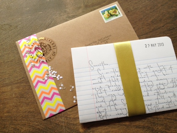
i also cut out some beautiful invites to a meghan hildebrand art show at madrona gallery in victoria. mixed with this mustard yellow paper, it made for a stunning combination. this little piece is traveling all the way to turkey!


i also cut out some beautiful invites to a meghan hildebrand art show at madrona gallery in victoria. mixed with this mustard yellow paper, it made for a stunning combination. this little piece is traveling all the way to turkey!
24.5.13
patience made | thinking about maps
sometimes when i'm bored at night and feeling adventurous, i go traveling. i visit all kinds of places - my favourites being sydney, australia, the coliseum in rome, and my parent's old house in the country. if you haven't guessed...i'm on google maps. sometimes i use satellite, sometimes i don't. in actuality, i'm not much of a traveller (not yet?), but i do love to look at maps.
my favourite map to look at is one of vancouver island and victoria, bc proper. i love to think of all my favourite places and to think about how these little lines and waterbodies have become a part of me. i've been thinking a lot about maps lately because i want to create one of victoria. below i have included a list of "creative cartographers" who use maps as inspiration, collage, science and mixed media.
i'm looking to do something more straightforward though - i imagine a gigantic sheet of arches watercolour paper, a thin black pilot pen, and a projector of google maps terrain. i want to mark down every inch of every road. and then somehow, i'll highlight my most special places...


quick outlines of maps of victoria and vancouver island by kaitlyn webb patience:

23.5.13
creator | lara scarr
i am a big fan of lara scarr. i've written about her here, here and also here. in her latest stroke of creative genius, she has designed a beautiful magazine as part of a graphic design school project. i'm incredibly disappointed that this beautiful little book is not a real product - it looks amazing! an issue dedicated to to handiwork and crafts, kraftwork is highly designed with an intense focus on type, digital collage and composition. oh and the best part - she featured me and my shop! (click the last image for a larger expansion).


21.5.13
art vs. art | aimee van drimmelen vs. leah giberson
i recently saw these pieces by leah giberson on lisa congdon's blog and immediately thought of illustrations by aimee van drimmelen.
aimee's simple watercolour renditions of lawn chairs remind me of summer parties. the chairs laid out, waiting for sitters, and then later half-heartedly packed up. the colours look tasty too - the yellow bleeding through orange into red makes me salivate for an icy summer treat.
leah's chairs give me the feeling that the sitter has left their seat only momentarily. perhaps they popped up for a quick dip in the pool, or to pull something off the barbecue.
all of them remind me of the lawn chairs from my youth, some in my nana's backyard, some outside hotel rooms near the beach. but which representation do i like better? (this is tough!!). but if you were to force me to choose - i would want to hang aimee's work on my walls.*
aimee van drimmelen
leah giberson
* and soon i will! i was lucky enough to stop by an aimee van drimmelen "sketchbook sale." i picked up some beautiful pieces including this bear.
20.5.13
snail mail | two from france!
in the past few weeks i've received some really lovely washi tape mail! the first is from riley, my australian pen pal in the states. i love this "bright idea" text she found. at least i think she found it...if she drew it than my mine is officially blown! lol. the second piece is from my good friend kristy, who incidentally is in town. which is perfect because although her letter was full of lovely compliments about myself, there was no info about her life!
finally, i received a number of postcards - one from toronto and...get this, two from france!


17.5.13
patience made | stationery sets
two years ago i began creating the mail art challenge. i compiled all of the bits and pieces that i had collected and couldn't bear to throw away. people seemed to love it! they created some beautiful pieces and sent me their photos with pride!
but now the mail art stationery set is all grown up. i've curated the pieces a little more closely and this is the result:


but now the mail art stationery set is all grown up. i've curated the pieces a little more closely and this is the result:
16.5.13
creator | rifle paper co.
so here's the thing...after nine months of working at the papery, i've become a bit of a stationery snob. i like to see things that are unique and creative! it's hard to see the same things in every store when i know how many talented handmade artists are out there. but sometimes things become popular because they are so unique and creative that everyone loves it!
rifle paper co. is a huge stationery company. you can reference this list to discover just how many stores it is sold in. when i was on my west coast road trip (i.e. my one week stationery haul) i bought at least four different rifle paper co. products! (many of which can be seen below) but earlier today i read an mini interview with anna bond (the creator) in frankie and i was tickled by her. we share many of the same thoughts about stationery and note cards.
when asked "how do you walk the line between a cheesy hallmark greeting and being memorable?" bond responded "all of our cards are blank on the inside. there's never a cheesy poem or something to just sign your name under. i love that, because i think a personal note from the sender is always the best way."
i couldn't agree more!
here are some of my favourite picks:
Subscribe to:
Posts (Atom)