Showing posts with label art. Show all posts

23.4.15

art | krista svalbonas


in two days we are moving. it's not a forever home, it's just another temporary home. i have to say - after ten years and seven apartments (plus three houses and two cottages for my parents) i am so so ready to have a home i can live in for awhile. maybe not forever, but long enough to settle. it's no secret that i am a homebody!

and so it seems an appropriate time to share the beautiful artwork of krista svalbonas. using a mixture of digital photography and collage, krista creates hybrid houses. some are a little country...and a little city too! (and in that way they would be ideal for my husband and i! he's a country mouse, i'm a city mouse).


12.3.15

art | rachel machenry

I think one of the biggest reasons I'm excited to be working for Craft Ontario is because I absolutely love the intersection between art and functionality - and there lay craft. Of course I love art for art's sake as well. But threading together the things we need and the things we find beautiful is really what creates the aesthetic fibre of our lives.

Below are embroidered fabric works by Rachel MacHenry. Blankets, a bench, pillows and the decorative enhancements on an ottoman style ball.  The detailing is exquisite and the colour selection subtle - but somehow the embroidery still pops!


28.2.15

career | predictions of failure


When I have an idea for a blog post, I make a note of it on my phone. Today, out of curiosity, I scrolled all the way to the bottom. There it said:

Fine Arts Speech for new entrants last week: Gave examples of how I am still in the arts field - though I graduated three years prior. So scared that being pregnant means that no one in this field will hire me now. My insistence on working in the arts will fail - but not for lack of trying. 

Here's the thing - that's exactly how it went down. I would love to say that my worries amounted to nothing and that I found my dream job as a curator while seven months pregnant. Instead, from September 2013 to January 2015 I applied for almost 50 jobs. I received two interviews and one part-time position at a gallery I had worked at before, in a role I had done before (lesser actually, than the level I left at). I didn't know if I would ever see the light at the end of this search.

That's awkward for me to write. It makes me feel useless, and unworthy. So let's look at the variables - what was different from before when I was able to find jobs I loved?

I was in a new location.
I was pregnant.
I had a newborn.

That being said, it's not like I was advertising these facts in my cover letter. I wonder sometimes if maybe I wasn't trying that hard because of the latter two. But I was! I was nervous about how I would make it work, but I wanted each of those positions equally, and with gusto.

I've just begun work with an amazing organization called Craft Ontario. They enhance the visibility of contemporary craft for their members and create engaging events that invite the public to explore craft. It's a contract position in which I plan their annual craft show and fundraiser. I could hug them for seeing how capable I am and how perfect this position is for me.

I don't think I'll ever figure out what happened in the last year and a half (career wise, though I'm still trying to figure out babies). Luckily I had my work for Ted Harrison, my paper shop, and a lengthy stint of support from the government. Hopefully this new position leads to new and wonderful things for me - because if I've learned anything during this time at home; it's that having creative projects is an absolute must for me - something else I predicted correctly.

20.12.14

art | lynne cohen

before moving to victoria, i worked at the kitchener-waterloo art gallery. now, back in ontario six years later, i am again working at my favourite public gallery.

i am totally enamoured with our current exhibition and thought i would share some images and info from our curatorial tour. although born wisconson, lynne cohen is known as a renowned canadian photographer from montreal. she unfortunately lost her battle with cancer in may 2014, but her artwork lives on in both public spaces and private collections.

her photos are 'immaculately conceived' and never hold a title or descriptor. they capture readymade places and moments in the passage of time. there are no people in the images, but remnants of their presence are clear. above all, cohen strived to find places which exuded a feeling of weirdness or anomaly and which felt slightly 'off.' locations include men's clubs, military practice areas, public facilities and halls - but here i am sharing some of her pool or 'spa' images.


11.9.14

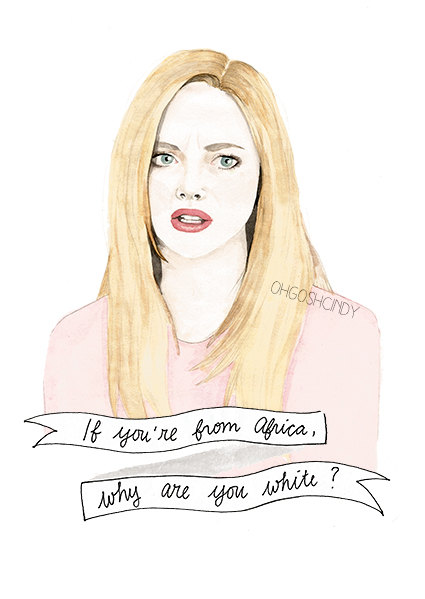
creator | oh gosh, cindy!

i've said before (a million times) and i'll say it again - i love modern watercolours. in a delightfully detailed twist, oh gosh, cindy! is helping us to time travel back to our teens where we hung out on the daily with bianca, cher, dionne, karen, gretchen and of course, the ever charming regina george.

i all honesty i wasn't aware that a portrait could be rendered so realistically in this medium. but cindy has captured every perfect detail of these time capsule characters - including one of my favourite quotes from ten things i hate about you: "i know you can be overwhelmed, and you can be underwhelmed, but can you ever just be whelmed?"

p.s. can i just say how much i love her watermarks? so classy and integrated.


22.8.14

art vs. art | april alayne vs. jen mann

i think every person has wondered which member of the animal kingdom best matches their personality and soul. artists april alayne and jen mann have taken that inquiry a few steps further with their renditions of hybrid humans morphing into or becoming one with foxes, fowl, wolves and horses.

april's drawings capture finite minutiae and wear their animal detailing like an accessory. jen's women sit side by side with their creature counterpart, though the viewer may be unsure which came first, or if the two are meant to be one. both artist's leave us with the impression that women are part animal, and take a sense of strength from them.

i truly can't decide this week which one i like best. i think because of the vast difference in medium it becomes harder to compare and i find myself equally drawn to both. how about you?

two things to note: these are only crops of aprils work, and the pieces by jen are from her collection a few years ago. i also interviewed jen here, and compared her against jenny keith here.


30.7.14

art vs. art | lis bailly vs. micah crandall bear

this is one of my favourite versions of art vs. art. why? because we're mixing media! two different artists, with similar results - though each used a different medium. in 2011 i posted about the photography work of lis bailly. i did such a good job of describing the photos and how they made me feel, that i encourage you to go back and read that. and then last week i was flipping through leslie's instagram (the clever artsy forager) and i stopped in my tracks when i saw a painting by micah crandall bear. the similarities are stunning! 

when comparing the two, you can feel the technological aspect of lis' work (i'm assuming there is an element of alteration after the photo has been taken, but i could be entirely wrong). micah's pieces are softer, closer to the reality of our world. i love the precision of the lines in lis' photographs, but the "imperfections" in micah's that allude to sloping hills and setting suns are intriguing. so i just can't decide - which do you prefer?

i feel it's important to add that both artists have a wide array of images in their portfolios and it's worth clicking the links above to discover more.


lis bailly


micah crandall bear


15.7.14

art | elly mackay

i am forever drawn to artwork which plays with multiple components such as collage, three dimensional perspective, and in the case of elly mackay, diffused light. her whimsical scenes recall fairytales and imagined faraway places. the way the artist designs each piece allows her to imbue it not only with different light, but a different atmosphere (moody, romantic, mysterious, hopeful etc).


8.7.14

art | roberto rosenmann & modern still life


i wrote here about my love for quirky still life artwork. here are the key components to what i think makes the perfect modern still life:

one | strange and unlikely objects (i.e. dish ware, keys and cigarettes), or fresh takes on expected objects (i.e. fruit, feathers and bones).

two | a unique presentation of objects (particularly those in an impossible or analytical context)

three | a crisp clear image bordering on photorealism

four | a modern and minimalist aesthetic (unlike the overabundance of centuries past)

five | a play of light without a reliance on chiaroscuro

below i'm featuring the work of roberto rosenman. his work checks off many of the points above and i absolutely love his choice of objects - playing cards! q-tips! piles of bones!


24.6.14

art | mantle art + artsy forager


my mother and father have this ongoing battle: he believes artwork should be professionally framed (even if it means spending lots of money), and she believes that you should find the cheapest frame possible (think $20 at ikea) because it's what goes inside it that matters.

and me? i think that frames are necessary and should be thoughtfully chosen. but i don't think they should break the bank.

which is why i was delighted when my friend lesley from artsy forager told me about mantle art and her new curated collection. mantle art offers carefully picked prints and professional, but affordable framing by skilled framers in the pacific northwest.

lesley's collection is a beautiful one. houses situated among a sea of nothingness, women with hidden faces and themes of mist, mysteriousness and modernity permeate her picks. i've included a few below but you can view the full collection here.


30.5.14

art vs. art | adele blais vs bonnie lewis

earlier this month i attended love art fair. a spin off of affordable art fair, and i was really pleased with the galleries that were represented at this event. or more specifically, i appreciated all of the art represented by the galleries. it was fresh, modern and far from the traditional landscapes one might expect would sell best at commercial art venues.

there was one artist however, that really held my attention. as in, i could barely leave the booth before i turned around and went back for more - adele blais. these borderline frightening, but elegantly pieced together portraits have a distinct piccaso-like feel. at first i didn't know whether i wanted to look away, or look closer. in the end the detailed collage* drew me in and i realized the sections of bright florals are more than they appear. within each knot of rainbow flora there lays a whole other world of shapes, icons and figures.

these hidden treasures reminded me of bonnie lewis' girls - including miss carefree #3. in lewis' work the key is layers - layer after layer of childhood imagery. when you look close enough, the multitude of characters and stories begin to reveal themselves - and so do the tools of girlhood trade (sparkles, glitter glue, collage clippings, doilies and even hidden "how-to" pages from vintage magazines).

and so i knew i must take this opportunity to post an "art vs. art." though in my book, everyone's a winner (whether it's adele's captivating women, or lewis' depiction of the lives of girls).


adele blais

*it needs to be said that the complexity and beauty of adele's work does not translate well to digital images. if i had encountered her images online first, rather than in person, i certainly would not have been quite so fascinated (or at all interested truth be told). and so instead i am posting photographs i snapped at love art fair.


bonnie lewis