i've encountered a bit of art world snobbery recently and it's really got me thinking. i wish i could tell you specifically why i'm upset but it's the point that matters, not the story surrounding it.
my whole belief system surrounding art is about making it accessible. i just want to get people into art galleries. you know why? because people are afraid of galleries. they think that they have to be quiet, and move super slowly. they worry that they have to completely understand the artwork. they fear that someone will try to sell them something they cannot afford. they wonder if there is a certain way to stand, and feel badly when they don't like what they are looking at. they believe that galleries and museums are reserved as tourist activities meant for visiting other places. so few people make a day out of visiting local galleries, and discovering what artisans have to offer in their own city.
art is lowercase. art is meant to be enjoyed and not feared. having events or activities in a gallery in order to bring people in and help them to feel comfortable in that space - what is so wrong about that? i just don't understand why gallerists would want to alienate themselves from the community around them. it is the people who believe art is high brow that perpetuate intimidation within the public. art isn't highbrow, it isn't even capitalized - it's lowercase.

31.7.12
30.7.12
snail mail | best of: papered thoughts
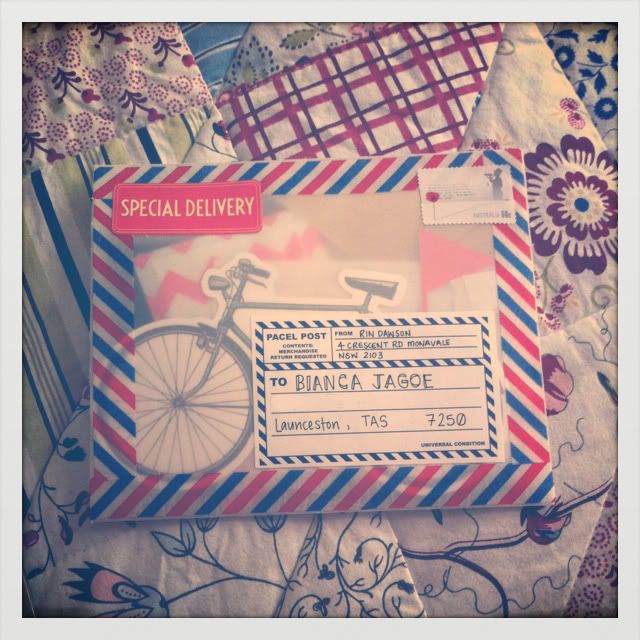
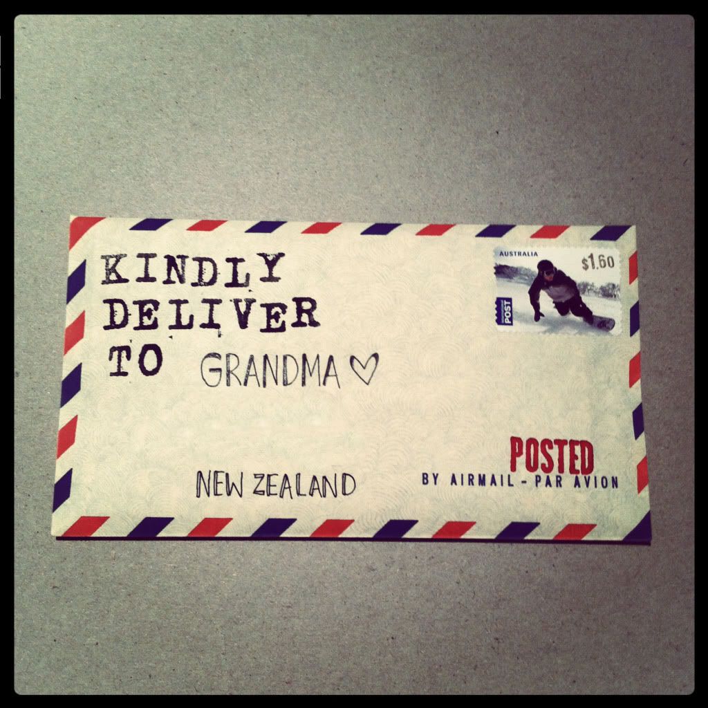
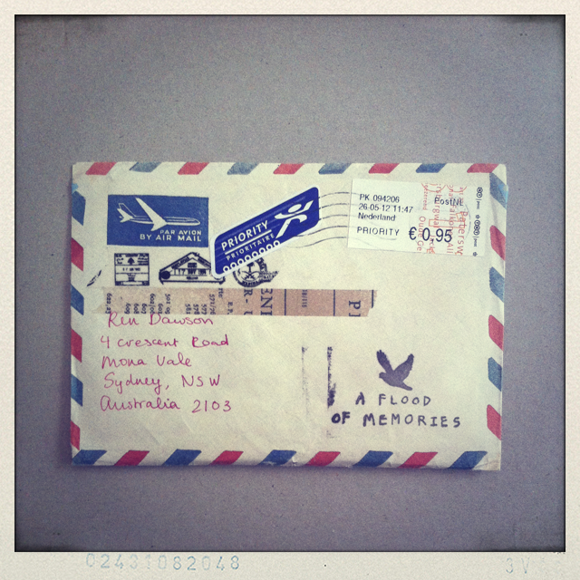
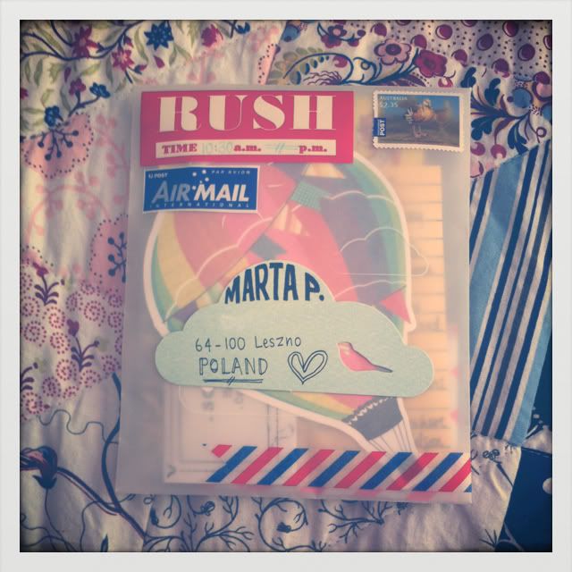
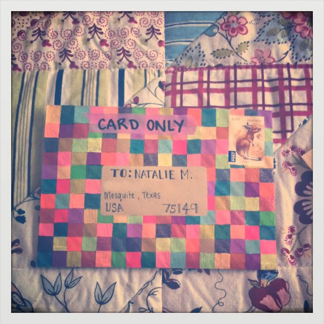
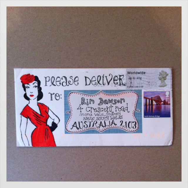
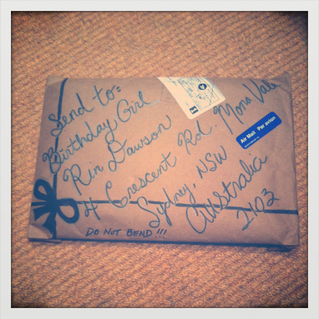
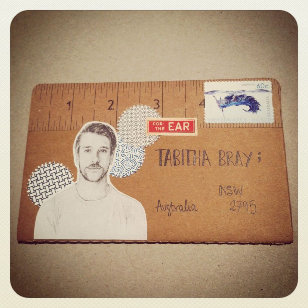
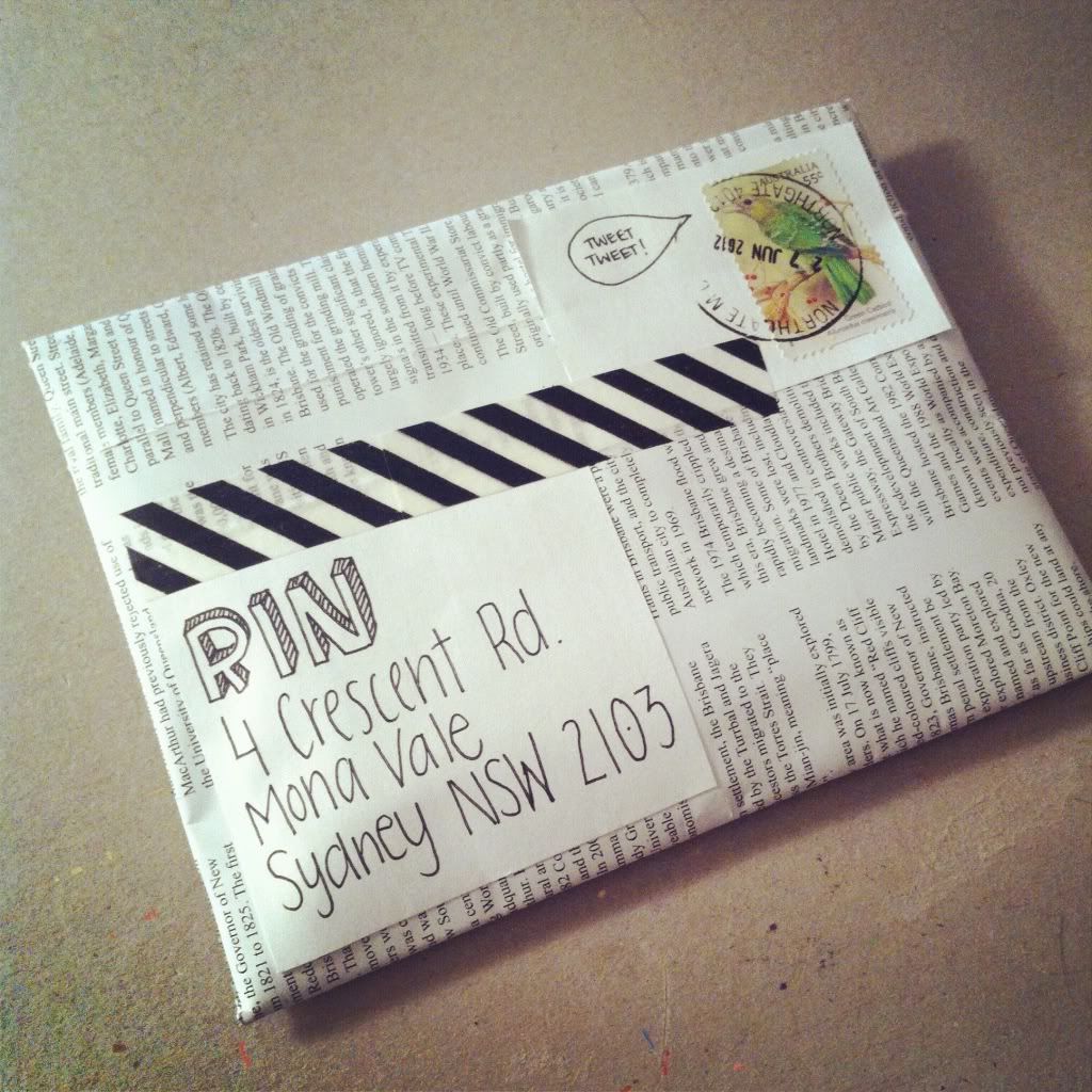
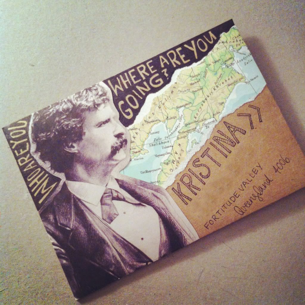
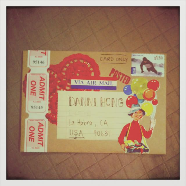
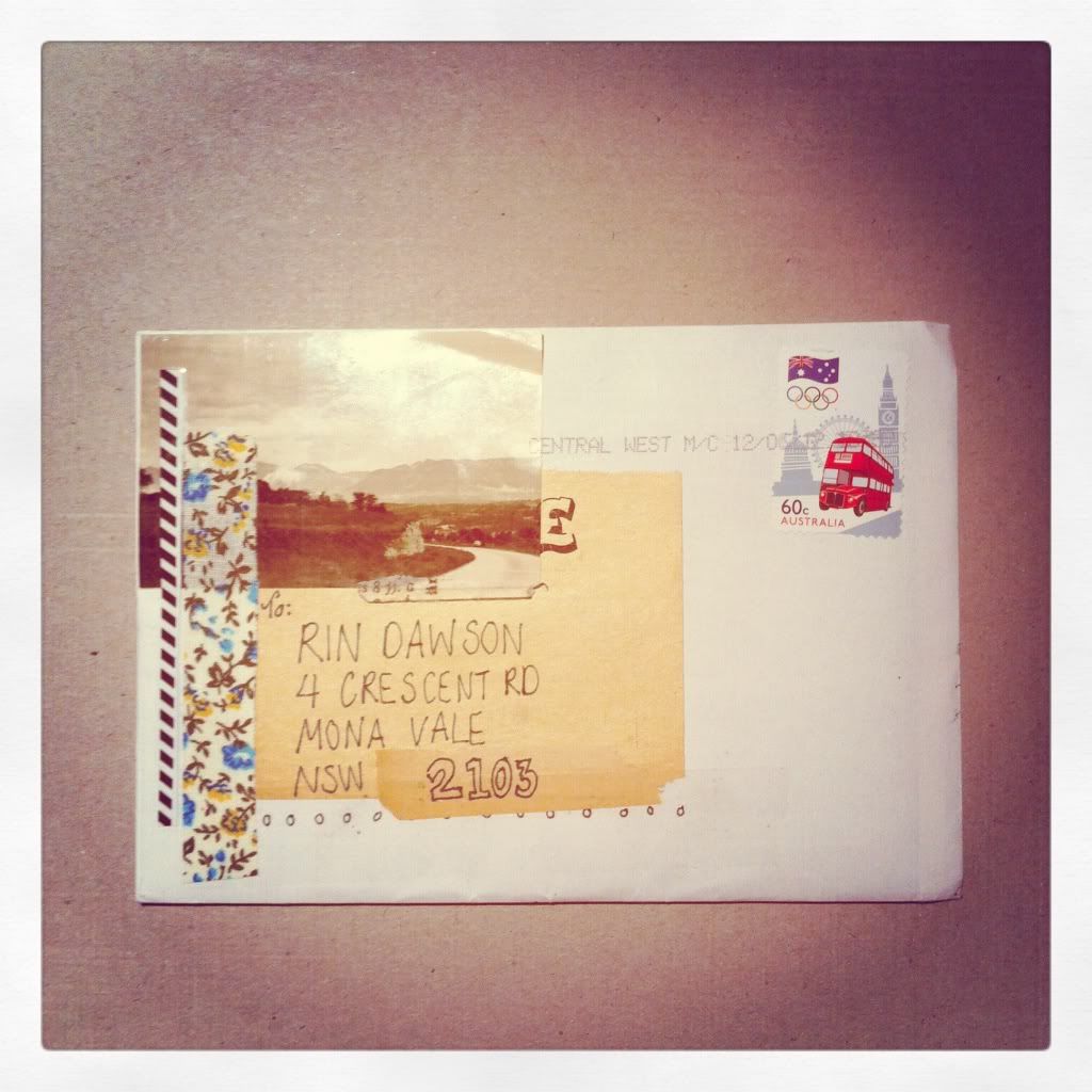
today's guest (last but not least!!) is rin dawson from papered thoughts. it took me about an hour to upload this post simply because i got so caught up in studying all the details of each envelope below. rin is the best mail artist i know. she's creates a neat chaos - something i am always aspiring to!
hello hello hello! i am rin from over at papered thoughts - i was super stoked that kaitlyn asked me to guest blog her monday "snail mail" post! i've decided to share a few of my many favourite envelopes i've sent / received. here goes nothing..
there is just something about that old fashioned red & blue that makes my heart skip a beat..
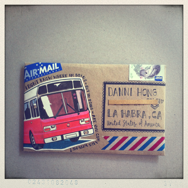
Is there anything better than a burst of colour delivered right to your mail box?

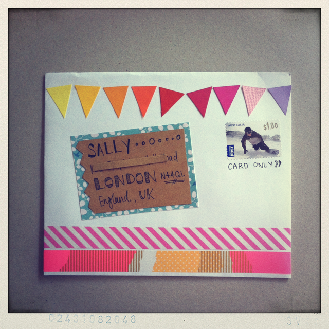

a hand-drawn envelope just for me! tou are too sweet!

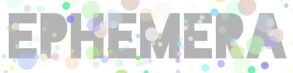
ephemera refers to things that exist, or are used and enjoyed for only a short time.. they may not have been made to last the ages, bu they do make the prettiest envelopes i ever did see.


okay lovelies! well i hope i've inspired you a little bit - go get some stamps & send some pretty mail!
29.7.12
sunday seller | the artful desperado on mammoth and company
gabriel from the artful desperado writes one of my favourite art blogs. why is it my favourite? easy - because you can feel his passion when he writes about art. each and every post is full of excitement about the subject and it just doesn't get any better than that!
hello everyone! this is gab from the artful desperado, super excited to be here sharing one of my favorite art shops - mammoth and company.
troy moth is the founder of this swanky online print store and he also happens to be a super talented photographer, no wonder why the site's so cool! - along with his creative team, troy has done a beau-ti-ful job curating the mammoth collection. what i love the most about this shop is the mix of mediums and styles - photography, mixed media, abstract paintings, you name it! oh, and their museum-quality prints (already got a few!) are the crème de la crème.
for this post i selected a few pieces that caught my eye, but you should definitely pop by their store and see the rest of the collection. enjoy!
28.7.12
slide school w substitute teacher | marcel duchamp
slide school is a bi-weekly education session (with myself ;) in which i attempt to remember bits and pieces i learned about specific artworks in my university art history classes. i get to peek at my notes, but not online. for more details about slide school - visit this post.
as i am away this week - i've arranged for you all top have a substitute teacher - artist meghann rader. you may know meghann as the one who made the most insightful comment ever or you may have visited her etsy shop. let's see how she leads us in slide school today!

image via
hello! my name is meghann and i spend my days making small scale artwork and handpainted jewelry inspired by my home on the beautiful west coast of canada. in 2006 i graduated from the emily carr institute of art and design in vancouver. i hope you enjoy my attempt at remembering one of the many fine pieces of artwork i learned about while studying there!!
title | LHOOQ
artist | the mutt toilet guy?
date | 1955 (random guess)
medium | marker or paint on a photograph
art historical period | pop art
three facts | i seem to remember that LHOOQ had two meanings. it could represent the english word “look”, and also sounds like a phrase in french that i believe means “i want to sleep with you”, or something along those lines. i think that these are both a comment on the whole mystery surrounding the mona lisa's famous smirk and the meaning behind it. corrections first of all, wow! i totally forgot there was a moustache. trend in the making?
corrections:
title | L.H.O.O.Q.
artist | marcel duchamp. another one of his famous works was a porcelain urinal, signed with "r. mutt". date | 1919. i was way off on that one.
medium | pencil drawn onto a cheap postcard reproduction of the mona lisa
art historical period | dada
i have now found out from wikipedia that when pronounced, the letters LHOOQ sound like the french sentence "elle a chaud au cul", which is translated as "she has a hot ass." also, i couldn't find any information referencing the smirk in regards to this work, so i guess i was wrong there. the word in the history books is that the graffitied postcard represents the theme of gender reversal, which was popular with duchamp and also ties back to da vinci himself and the sexual ambiguity of the original artwork.
27.7.12
wade made | lemon jitters makes mini-bins
i'm delighted to introduce katie - a girl who's last name flows a heck of a lot better in this friday feature than my own! i love katie's blog, lemon jitters. it's the perfect place to go for crafting inspiration...plus she's a bit of a perfectionist like me.
hey isavirtue readers! i'm glad to be visiting today while kaitlyn is away (did anyone else catch that rhyme?).

i recently ordered some really fun scrapbooking paper. i'm not actually a scrapbooker, so i have to think of other ways to use this pretty paper. i am always adding bright office supplies to my desk because i work in a dull office. the windows in my office (which i share with three other people) are so high you can only see the sky. so i am forced to brighten the office with my office supply addiction, which is fine by me. :) all of that to say - i decided to make some mini-bins for my desk.

i used kraft cardstock to make the bases and then covered them in pretty paper. i added a bit of washi tape to one and trimmed the edges of the other in coordinating paper. ta-da! office brightened.

here's a close up of the paper. i actually branched out using this paper because it is not my usual style. what do you guys think?
thanks for letting me visit, kaitlyn! if anyone wants to say hi, you can find me on my blog, twitter or instagram!
hey isavirtue readers! i'm glad to be visiting today while kaitlyn is away (did anyone else catch that rhyme?).
i recently ordered some really fun scrapbooking paper. i'm not actually a scrapbooker, so i have to think of other ways to use this pretty paper. i am always adding bright office supplies to my desk because i work in a dull office. the windows in my office (which i share with three other people) are so high you can only see the sky. so i am forced to brighten the office with my office supply addiction, which is fine by me. :) all of that to say - i decided to make some mini-bins for my desk.
i used kraft cardstock to make the bases and then covered them in pretty paper. i added a bit of washi tape to one and trimmed the edges of the other in coordinating paper. ta-da! office brightened.
thanks for letting me visit, kaitlyn! if anyone wants to say hi, you can find me on my blog, twitter or instagram!
25.7.12
art vs. art | length x wit compares marco suarez vs. monika traikov
liza oldham is the queen of cool finds. seriously - honestly wtf is cool - but liza at length x wit is even better! we both appreciate unique art pieces and liza is often drawn to very sculptural type goodies. she's put together an amazing art vs. art post for you today (and you know that it's my favourite feature and i wouldn't just trust it to any old blogger!)
hello! i'm liza of length x wit. when kaitlyn proposed a post swap a couple weeks ago, i jumped at the chance. isavirtue is one of my favorite places to visit to get my art fix. from slide school to q & art, kaitlyn's posts always make me stop and think a little deeper beyond my initial impressions about whatever it is she's found. i'm so excited to take part in her art vs. art series and share with these two artists with you today. enjoy!
marco suarez and monika traikov both play with landscape and geometry, but with vastly different results. suarez encases his photographs within a circle, making each scene seem like a look through a spyglass. there's a sense of mystery and yearning to each of these vistas, and their shape only adds to the romance. traikov puts geometric shapes directly into photographs and uses them as a means of distortion. rocky shores are flipped, towers melt, and cities are turned on their side. looking at these two side-by-side reminds me of the difference between fantasy and science fiction - similar fictive elements, but divergent worlds.
24.7.12
musings | art social on becoming a blogger
erin cassidy from art social is taking over the musings feature today. she has put together an amazing piece with an even more amazing metaphor about becoming a real blogger.

photo by kate donaldson photography for artsocial
anyhoo, i didn't exactly have high expectations for a lecture on flavoring. i mean, it's about flavoring. but, holywow guys, it was probably one of the most interesting presentations ever. a few quick facts about artificial flavoring: 1) there are 500 flavorists in the world whose identities are totally top secret. 2) artificial strawberry flavoring can come from parts of a beaver you'd never want to knowingly eat. only the brave should google this. 3) whether artificial or natural flavoring, it all breaks down to chemicals. whether man-made or nature-made, it's all (basically) the same thing. clearly i didn't study chemistry in school since i thought this was super cool.
the part of this lecture that stuck with me the most was a concept called 'chasing zero.' this is a term used by flavorists when they're trying to make artificial flavors taste the most like natural flavors as possible. in other words, they're trying to get their artificial vanilla to taste like real, natural vanilla as best they can. the closer they are to closing that flavor gap, the closer they are to zero. this term makes the whole process sound so adventurous and meaningful and romantic.
for some reason this made me feel super philosophical, like maybe we're all in some way or another chasing zero in our lives. we're all trying to close the gap between trying to achieve something and achieving it, arriving at the destination after periods of trial and error. i've noticed on my blog, i've talked about wanting to be a blogger instead of saying i am a blogger. i think when you start something completely new - whether it's blogging or creating an artificial orange flavor - you start by emulating what you think the real thing looks like. then over time - through testing, reevaluating, and sometimes throwing the whole batch out and starting over - you end up with something real and more authentic than where you started. i think i'm still chasing zero when it comes to being a "real" professional blogger, but i'm gettin' real close to closing that gap. guest posting on an awesome blog sure helps :)
but i guess that all depends on what you think a "real" blogger is. is a real blogger someone who posts everyday, week, month? someone who's actively interacting with other bloggers? someone who makes money blogging? someone who simply includes the word "blogger" in their twitter bio? i think there's a big difference between being a blogger and simply having a blog. srsly a lot of people have blogs, but i think only a small percentage would consider themselves bloggers... what do you think?
23.7.12
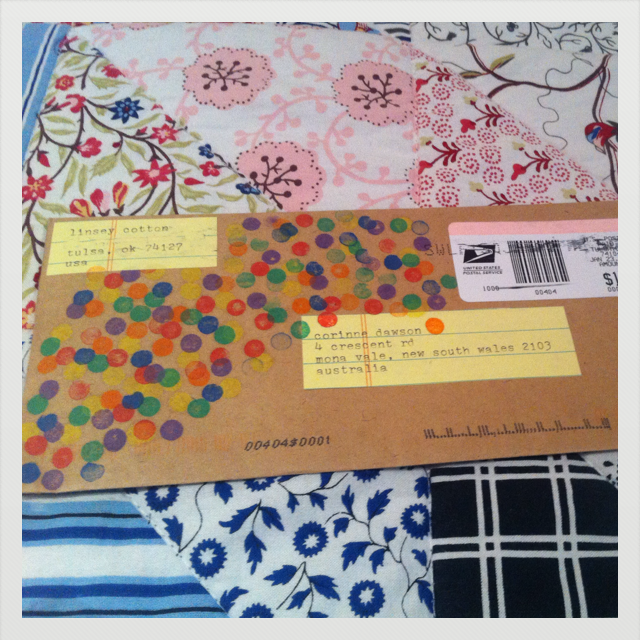
snail mail | confetti/sparkle envelopes & cheating
today i am flying to from british columbia to ontario to see my family and friends. i'll be there for about a week and so i've arranged to have some amazing guest posters do my regular features throughout the week!
for now i'm sharing with you some wonderful surprises i received in the mail this past week. the first confetti themed envelope is from rin dawson at papered thoughts who will be posting here next monday. isn't it beautiful??
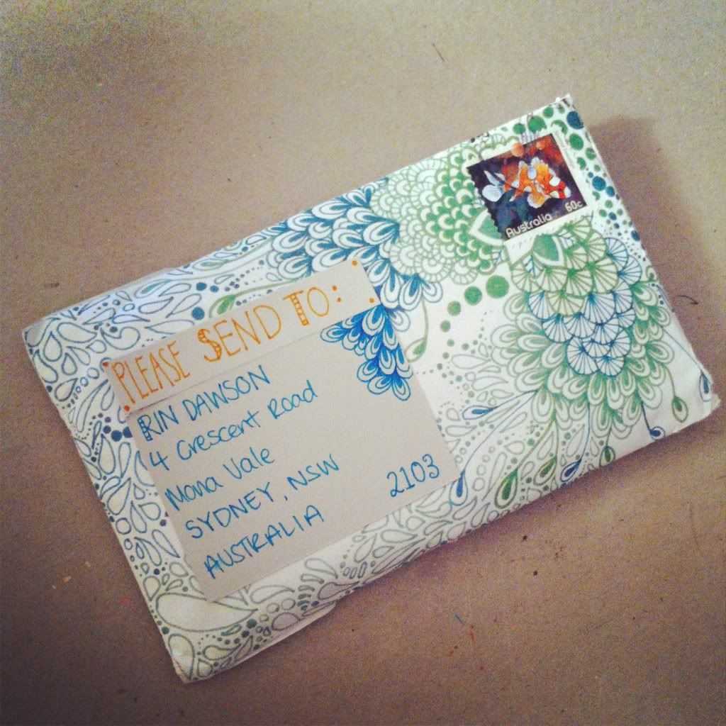
the second is from my new pen pal holly. at first when i saw it i was like "where is the address?" haha - it was so large and sparkly i completely missed it! pretty cool though huh?
the third piece was a cheat. my best friend put my name and her address on the centre, and her name and my address as the return. then she conveniently "forgot" to put a postage stamp on it! i can't say i condone this but you have to admit it's a rather fun and sneaky idea!


Subscribe to:
Comments (Atom)