31.5.12

snapshot | forager, friends and failed attemps


one | this is a lovely little print by belafonte on etsy. i used this as part of my upcoming guest post on artsy forager. it's all about the types of art available for purchase.

two | i've been having a little sale in my stationery shoppe and a bunch of ladies took advantage! here i am packing up orders from the weekend.

three | i loved the decor of a new hair salon i tried called "the hive." they seriously have the best branding - check out their website!

four | i met up with some friends for dinner on monday night. i haven't seen one of them for over a year and even then it was only for two seconds at our wedding! it was so great to catch up.

five | this is pretty much how i have been feeling for the past week. i swear, i'm nauseous all the time and i have no idea why! pregnancy jokes are appreciated but not accurate.

six | i am such a dummy! i tried to replicate a project i've done before involving a wooden cradle canvas, pretty paper and resin. well, there was a note in the resin instructions to seal paper and wood first, but i thought "i did this before without sealing the paper and it worked out fine!" well it didn't work out fine. the paper absorbed all the resin and so when it dried i had to peel it all off. back to the beginning! the reason it worked before was because i used wallpaper...which is already sealed.

30.5.12

q & art | jen mann

today i am very excited to introduce a new series on the isavirtue blog! entitled "q & art," the series will feature interviews with amazing contemporary artists. today i am featuring 
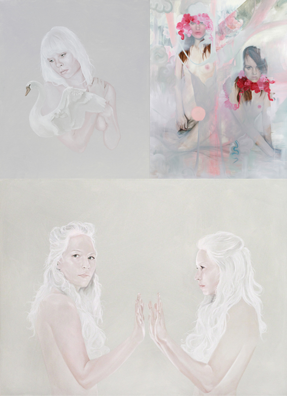
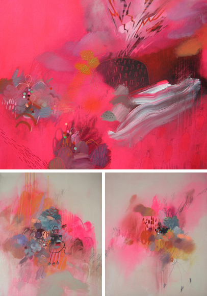
jen mann. jen has created beautiful series of paintings portraying an interconnectedness between women and nature. jen is also currently being featured in the lowercase gallery - i encourage you to go check it out! then tell me your thoughts on her work in the comments below!

q | when did you first begin creating artwork? (not as a child, but with the intention that it could act as a career) 
artist jen mann: i don't entirely know. i remember at an early age wanting to become an artist, but i don't really know when my work went from studying art, to that of a career as an artist. i studied art at a high school which was specialized for art, and then proceeded to university, with the same intent of becoming an artist... i would definitely say that i would pinpoint my production of art after university, as a full fledged decision of my art being my main focus and career, but i cant say when i first began creating work with the intention of being a professional artist.. the lines are blurred. my fera collection of paintings however (2009-after graduating with a bfa), are my first works that i felt truly captured my intent.

q | while completing your bachelor of fine arts, you concentrated on printmaking. you now create oil paintings - what led to the the change in media? do you anticipate experimenting with other forms of art-making in the future?
jm | i think after making multiples for a certain length of time... and also in a school environment, one full of criticism and expectations... i was quite ready to do something more immediate, more passionate and expressive. i felt the time intensive, and laborious process of printmaking was, in short, under appreciated, not understood, and overwhelming for me after graduation. i did not have a print shop readily available and no presses at my disposal either, and after graduating i was home sick for the familiar feel of drawing directly onto a surface. i had never painted in oil before, but from my experience with printmaking, i loved the texture of oil based inks, and i found the medium familiar and friendly. i have experimented with so many different mediums, and enjoyed them all. i am currently planning some sculptures which i have planned for my gathering of the psyche collection.


q | why did you choose a traditional and difficult medium such as oil paints? in what ways does this medium work for you and your artwork?
jm: i probably chose it for its honesty and authenticity. i love the realness of a painted canvas, there is no questioning what it is. oil painting just fit, and as i continue with it, i learn a lot about my own style and techniques.

q | each of your series are so concise and focused in both theme and mood. how important is it to you to have a well curated and complimentary collection?
jm | i like organization. maybe because i am a virgo, who knows, but organizing my thoughts and visions into thematic and concise collections is natural for me, and beneficial in creating a body of work that flows - like a train of thought. it keeps my mind free and uncluttered. people can visually sink into the collection, like a world created for them to slowly unravel ideas, and work out meanings, whether they are my meanings, or their own.


q | tell me more about the connections you make between humans and nature, and humans and animals. why do these themes hold importance for you?
jm | humans are animals, and as animals we are born of nature. "the wild" is like a nostalgic past i never knew. i love fantastical stories of feral children raised by wolves, and the magic of the woods. i am enchanted by this idea. there are so many things we truly don't understand, and that is beautiful. i love the subconscious mind - how it reveals things about ourselves. for me my youth was full of forest adventures with my brother, climbing trees, catching bugs, toads, and crayfish... watching deer pass through my backyard, foxes, coyotes, and rabbits. something about youth is defining, and has, certainly for me, created this longing for a connection with the wilder side of myself. someone free. my subconscious plays out this imagery, as i work through things in my own life.

q | have you received any skepticism about showings of your work because of the nudity and/or eerie imagery? (don't get me wrong - those are some of my favourite aspects!)
jm | i think nudity, and eerie-ness or oddity, is fairly accepted in the art world, though maybe not so much by elderly relatives hahah.

q | where do you find your inspiration?
jm | dreams, life, and the forest i find myself so often watching or traversing through. i think mostly from myself, and my own wanderings and explorations into life.

q | it seems you have completed a number works in the past year - any particular reason for the heightened output?
jm | about a year ago i re-did my studio, creating a space that is more conducive to working. i think this has helped me a lot. i think i have also been just really inspired and excited about what i am doing.


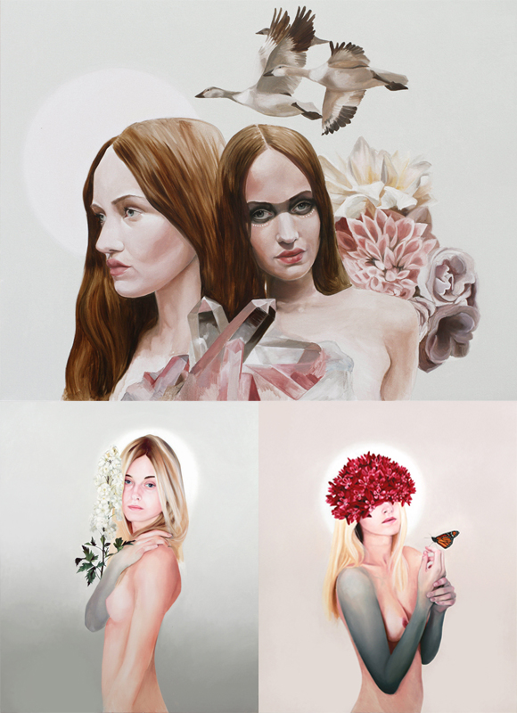
q | how are your own opinions about feminism and the female body expressed within your work?
jm | there are a lot of feminine issues woven into my work, probably because naturally as a female i deal with these issues personally, and the deep rooted ideas about what is beautiful and feminine are so rooted in our culture we don't even notice it as strange or against nature. my "toxic love" series probably deals with these issues the most, looking at our 'toxic love' of beauty, and its crippling effect on our self confidence, and sense of self, as someone more than just our outward appearance.

28.5.12

snail mail | send something good final reveal

the time has finally come for the big reveal of the send something good packages! leading this project with gentri and kristy has been so much fun for me. i loved the challenge of creating a seamless list of participants and matching them up with people in different states or different parts of the world. send something good has really become like my baby throughout the past two months. thank-you to everyone who supported my stationery shoppe by purchasing send something good products (by the way, i'm currently having 25% off sale and there are some ssg items left over!) and truly - thank-you to everyone who participated in this project. it was such a pleasure to meet so many amazing and passionate young women.

below are images of the package i sent to katie of lemon jitters. katie lives in colorado and we have a lot in common. so not only was it fun to pick out goodies for her, it was easy too! i sent stickers, collage/scrap papers, a notebook, make your own watercolour cards, my stationery, fold and mailers and a handmade mint green basket! you're wonderful katie and you deserved all of it and more!


i received an awesome parcel from mariaana (let the time roll by) in norway. i was nervous because although it was beautifully wrapped, it had gotten a little roughed up on its journey! but amazingly - everything inside was in perfect condition!! and by everything i mean...there was a lot of stuff in there! she included chocolates, european delights, a photograph, postcards, stickers, note cards, a unique candle, picture frame, bracelet, keychain and more! i loved the little notes she included and the mix cd she sent me was wonderful :) thanks mariaana!


27.5.12

sunday sins | taking the car

for the past two weeks i have been avoiding eating pre-made or processed food. surprisingly the time flew right by! and guess what? every meal i had was made from whole foods. but you know there has to be a catch right? well snacks, that's the catch. when it comes to snacks i prefer candy and treats and mechanically processed delights. oh, and on thursday night i was sick so jon made me a can of chicken noodle soup.

but aside from that...it was actually a lot easier than i thought!

richard estes. bus interior, urband landscapes no. 3, 1981. image via

i can think of soo many times when i am downtown after work, shopping, or at a meeting and i call jon and ask him to come pick me up. or i'll finish at the gym and think "i just want to be at home now!" so i ask jon if he would mind dropping by the gym after work. except it's not on the way, it's totally out of the way. and when i'm downtown...i could just take the bus. i don't like the bus, and it costs less to have jon drive then it does for me to pay for the bus all the time. but that's not very good for the environment is it?

so for the next two weeks* i am going to avoid riding in cars (with boys. haha). but seriously, it's warmer now, so there's no reason i shouldn't walk, ride my bike, or wait for the bus. wish me luck!

*just a little note to say that i have to go grocery shopping tonight. sorry, but that's it i swear!

25.5.12

isavirtue | spring cleaning sale

well, it feels to me like summer is finally here - woohoo! it's beautiful in here on vancouver island year round but there's something magical about the summer. i came home from work this evening and found myself with the urge to create some new products. but then i felt guilty because i already have so many items in my shoppe (my closet is bursting with stationery!). so help me clean out my closet and then i can make new products :) just use the code SPRINGCLEANING for 25% off


24.5.12

patience made | aerogram fold and mailers

sometimes i think that people don't send snail mail simply because it takes too long. and it's true - sending a text or a tweet or an email is sooo much quicker. but which is more special i ask you? which of these things will make your recipient squirm with delight? likely not the tweet!

so in order to save you time - i'm kickin' it old school with these new aerograms. an aerogram, or aerogramme, or air letter was largely used during the second world war. for a very low price, you could purchase a self sealing fold and mail envelope. during wartime, when money was low and rationing was the name of the game, aerograms made it easier to communicate with loved ones and soldiers.

nowadays you couldn't send a traditional aerogram because they are too light! i've seen some booklets of fold and mailers here and there and i would be surprised if the post office let you mail them. they are far too weak, and far too thin - less than the weight of a postcard!

my aerograms are made of heavy 70 lbs cardstock, do not require licking, are more private than a postcard and waste less paper than a greeting card + envelope. plus - total time saver - all you need is the stamp!

happy mailing!


new journal style


old style


*custom orders for colours and images are always welcome :)

snapshot | flowers, fortune dolls and fine days


one | this is the pattern on one of my new dresses - pretty and summery isn't it?

two | i posted about these wonderful fortune dolls by lara scarr and now i'm going to take the plunge and bring one home to live with me next week!

three | i love summer in victoria because the open air tourist buses are zooming all about town :) i feel like i'm on display but it's still fun to see!

four | a random, really involved project that i started with the intention of mailing it to someone. but it didn't turn out quite how i intended so i'm not sure if i will finish it now...

five | almost every day i have to walk or ride past this. they are tearing down an old hospital wing but it was so beautiful and so it breaks my heart :(

six | i visited a lovely end of town on a very fine day this week. i enjoyed steak frites with some of my best friends at bon rouge, one of victoria's best restaurants.

23.5.12

art vs. art | kristi malakoff vs. jen stark

i found kristi malakoff recently on honestly wtf and discovered jen stark a year ago in the online cooper cole gallery (formerly show and tell) during my maya hayuk obsession.

kristi and jen both play with paper - but they take it to a whole new level through shape, colour and presentation. before i provide a comparison, i want you to take a peek at these pieces by kristi. note the similarity to jen stark's work below.

however, those are not the pieces i am going to post in representation of kristi. while interesting, i don't feel that they are the best or most unique of her work. instead i am going to show you a beautiful selection of black paper grave crosses.

both selections are absolutely stunning - but which do you prefer and why?

jen stark


kristi malakoff


22.5.12

musings | the male gaze

in my art history classes we spoke at length about the male gaze. about paintings which were created simply to entice the male viewer. but art class wasn't the only place i experienced the male gaze...

an interesting thing has happened in the past few years - men no longer pay attention to me. gosh, i hate the way that sounds. don't get me wrong - i'm no hotsy totsy. i'm not skinny, or tall or classically beautiful. but i've always received attention of some sort from men. whether it be as genteel as looks and hellos, as brazen as cat calls and kisses, or as straightforward as being asked on a date. but these little confidence boosters have gone by the wayside.

i know - i shouldn't be 'complaining' because i have a wonderful husband who cares for me very deeply (and claims to be attracted to me!). and trust me - i feel just as strongly for him. but i firmly believe that many women still want to feel attractive in general. which means that maybe every now and then you lock eyes with a total stranger. or maybe someone you meet in passing asks you out - at a work event or a cocktail party. and if like me, you are attached - you can demurely refuse the advance. "i'm so flattered but actually, i'm married."

i've thought of various reasons as to why this change has occured. none of them leave me feeling warm and fuzzy - and some i hope for more than the others.

one | i'm getting older. well you can't do much to fight this can you?

two | i've gained weight. as much as i want it to be any of the other reasons here, i just know that this plays a huge role in being admired.

three | men can sense that i'm taken. friends tell me that wearing a ring is like a red light but since i don't notice wedding rings on others, i feel like it goes unnoticed on me. but i do believe that on level men can sense that i have no interest in a relationship or connection. and so perhaps they subconsciously pull away from me.

four | chivalry is dead. ha! i just had to throw this one because it puts the blame on them instead of me. though i am curious about how single women experience the world nowadays. do guys still ask girls out? is that too forward for our feminist driven society? does it have to happen organically and over time?

either way - i think i'm definitely entering a new stage of life. one in which i lack the same carefree attitude and am no longer an advertisement for youthfulness. i think i'm ok with that...but my self esteem might take a bit of a hit!

21.5.12

mail | arthur, after xmas and art dissection

this week i made a number of fun mail pieces! the first set of images shows a package i put together for my good friend magdalyn. it's a little archie grand journal (love 'em!), a vintage article by group of seven painter arthur lismer and a letter on old school hilroy style paper. again, thank-you heffel auction catalogues!

the second set of images show a creepy xmas card i found at work. but the cool thing about it is that it's an actual silkscreen print! on the back i cut out an image advertising an upcoming art gallery of alberta exhibition. i wish i lived near this friend so that we could check it out together. the only problem with this postcard is...i forgot to put the address on it and then i misplaced it so now i have to find it before i can mail it! oopsie.

the third set is one of my favourite pieces that i have made to date. ira hoffecker is a victoria artist i admire (i posted about her here) and her work has been in just about every local magazine lately. so i took advantage of that and cut out all of the images, dissected the piece and interspersed awesome quotes about her paintings. i then mailed it to her and it made for a nice little surprise!

p.s. QUESTION! what colour is this font?? please leave me a comment telling me what colour it is, and what colour my links are (see above). thanks!!


20.5.12

isavirtue | blog inspiration

happy victoria day weekend! hmm, now that i think about i'm pretty sure that's a canadian thing - queen victoria and all. it's particularly appropriate for me because i live in victoria! either way it means i get some paid time off this weekend - woohoo!!

i'm still loving my new blog design and i thought it would be fun to  show you the "inspiration"behind it. i sent the following images to savannah at maiedae and i think you'll agree she did an amazing job at interpreting them into a blog. if you are looking for a designer who is talented, listens and has reasonable rates then sav is the gal for you!

the last image is one she shared in a post about my blog design.


19.5.12

slide school | monet

slide school is a bi-weekly education session (with myself ;) in which i attempt to remember bits and pieces i learned about specific artworks in my university art history classes. i get to peek at my notes, but not online. for more details about slide school - visit this post.


image via

*if you are doing some sort of school project and ended up here, please note i cannot guarantee that any of this information below is even remotely accurate!

title | rouen cathedral
artist | claude monet
date | hmm, okay, the impressionists began in the late 1800's so i'm going to say 1885?
medium | oil on canvas
art historical period | impressionism
three facts | monet and the impressionists cared less about painting a realistic portrayal of their subject matter, and more about capturing a moment in time - a moment of light. monet painted the rouen cathedral over and over again* at different times of the day simply to capture the various forms of light it reflected. this is why you'll see this same subject matter in red, blue, green and yellow. 

corrections:
title | rouen cathedral, facade.
artist | correct! (whew! *wipes brow)
date | 1892-1894
medium | correct
art historical period | correct
*he painted it 30 times? source

17.5.12

patience made | time for teal!

i've been wanting to expand on some of the colours i use to make stationery but i'm not ready to go full blown rainbow just yet. then jon shared with me his awesome idea to do various colours - but only for a limited time - about a month. and so, "for a limited time only," i give teal!*


*i'm a little frustrated. while i'm super happy that it's sunny like every day, it makes it incredibly hard to photograph the colours of my paper accurately. these are a bit more green than what you see above. sorry!

snapshot | mountains, materials and my new skull


one | the view from mount tolmie, near our place. i feel so lucky to be able to walk up there and enjoy such an amazing panorama. 

two | a little crop of one of the bridal gowns my best friend tried on. i can't wait to see what she finally picks!

three | mine and jon's feet as we paused during our walk up said mini mountain in number one.

four | my new favourite dress from dorothy perkins!

five | my bike. we have been spending a lot of time together as of late.

six | a new necklace and i looooove it!

16.5.12

art | bianca green

i can't believe it's wednesday! i feel like the weeks are just flying by - which is strange because there isn't much happening in my life right now. and so if anything, time should be crawling on like a turtle. maybe it's the excitement of summer arriving. jon and i have started eating dinner on the balcony together and going for walks up mount tolmie next to our condo. these are things that are best done in warm weather.

you know what you can do in any weather? enjoy art! today i would like to share with you these works by bianca green. i just love how she takes different sections of an image and fills it in with various textures and colours. it really adds an energy to each piece. i also included two images of woman because they remind me of these photographs and these ladythings - which i've always loved.


15.5.12

musings | holidays

from late april until early november, there aren't any gift giving holidays for jon and i to celebrate together*. this is a fact that makes me incredibly sad, but i'm quite certain he relishes those seven months! me, i make the most of father's day, my brother's birthday, thanksgiving and halloween. why? because i just love holidays! depending on what religion you are, and even if you aren't religious, there are about ten-fifteen holidays through the year (give or take birthdays of loved ones and anniversaries, and i'm counting christmas as a cultural as well as religious holiday at this point). 

so think about it..fifteen days in year, out of three hundred and sixty five. it doesn't seem like a lot now does it? it's not really!

and what could be more wonderful than fifteen days which are directly intended to celebrate family, friendship, love, thankfulness and camaraderie? can you think of anything more beautiful?

and yet people seem to struggle with holidays. they hate them. they think it's stupid. they don't know what to give people. why do they have to give gifts at all? it's just one day. what's the point?

the point my dear friends, is to celebrate and honour your friends and loved ones. i truly can't think of anything more wonderful than fifteen days dedicated to this task! some people say that they can show they care any day of the year, and why does it have to be delegated to valentines day, or christmas?

but the way i see it, people tend to forget to cherish the one they loves with overt forms of communication. over time we begin to take each other for granted and fall into the comfort of patterns and everyday life. so there is absolutely nothing wrong with a little reminder...a little push. and when we remember just how lucky we are to have these people in our lives, we can write a little card, and give a little gift to show them how we feel.

nothin' at all wrong with that...

* i mean, in celebration of each other, of our relationship. involving gifts usually. 

13.5.12

snail mail | art mag mail art

this past week, all the seasonal 'free' art magazines came out. for me, on the west coast that means galleries west, where, preview, boulevard and focus. and okay, i also used last years heffel's fine art auction catalogues.*

i'm really loving the first one, and i may use it for my lovely letters pen pal who lives in germany. the second one i'm not so fond of...


* and if i see another group of seven painting being auctioned for 150,000 dollars i might scream.

sunday sins | processed food

for the past two weeks i have been trying to avoid buying useless craft supplies. i think it's safe to say that i not only succeeded. i totally aced this one!! i didn't buy a single craft item - useless or otherwise. it probably helped that heather and gentri both mailed me rubber stamps (i was satiated on that front). however, i still found myself right near a craft store one day that i don't get to go to very often. and i had time to kill! but i didn't go in! i was also at an art store getting supplies for work and didn't buy any for myself. yaaay kaitlyn!

image via

this week's sin is not for chumps. for the next two weeks i am (apparently!) going to avoid eating processed food. i know kristy is laughing. but to help you understand why this is so hard...for me, eating a can of campbell's soup and some toast would be a good lunch. as in, healthy. i know deep down it's not actually and that i should make my own darn soup and put butter on my toast instead of margarine. i love easy food and and i've been told i'm craaazy - because i actually enjoy the taste of mechanically processed food over natural. maybe it's the way i grew up. my mother always made sure we had balanced meals and there was never any treats in the house. but she bought the "chicken+pork+whatever else was in the factory that day" hot dogs as opposed to "all beef." so now i prefer them. i'm going to try and look up some recipes and actually cook something in the next two weeks but i think the overall goal here will be food that doesn't come from a can or a box. that's the best i can do.

goodbye alphagetti.

to learn more about sunday sins, click here.

12.5.12

exhibition opening | meghan hildebrand

do you know what time it is? OBSESSION TIME!!!

i've always liked meghan hildebrand's artwork. i think i first saw it in "poster on canvas" format while working at a little gallery/decor shop. i thought it was hipper than much of the other canvases (which were of ducks and flowers and rocks). though at that time her work was less abstract and more representational. then i was introduced to some of her originals at madrona gallery in downtown victoria. i could see her style altering even then - in a good way! but this week i saw her newest collection.

and it's neon.

and i am in love.

and so today, the lowercase gallery is featuring the beautiful artwork of meghan hildebrand. from her newest series, "flotsam, jetsam, lagan and derelict."*


.
*take note of the titles at the end of the gallery. they ROCK.

11.5.12

patience made | writing paper

i made a bunch of writing paper packs with these new images weeks ago but then i took them to a local store and had to delist them in my etsy shoppe (i don't like to list products that i don't literally have available). but i finally found time to make some more yay! except for the first set below - that image was a recent gift from my super sweet friend gentri. and i love it!! do you?